Vectren
The first major website and customer portal redesign
undertaking by this customer-focused gas & electric utility.
The project
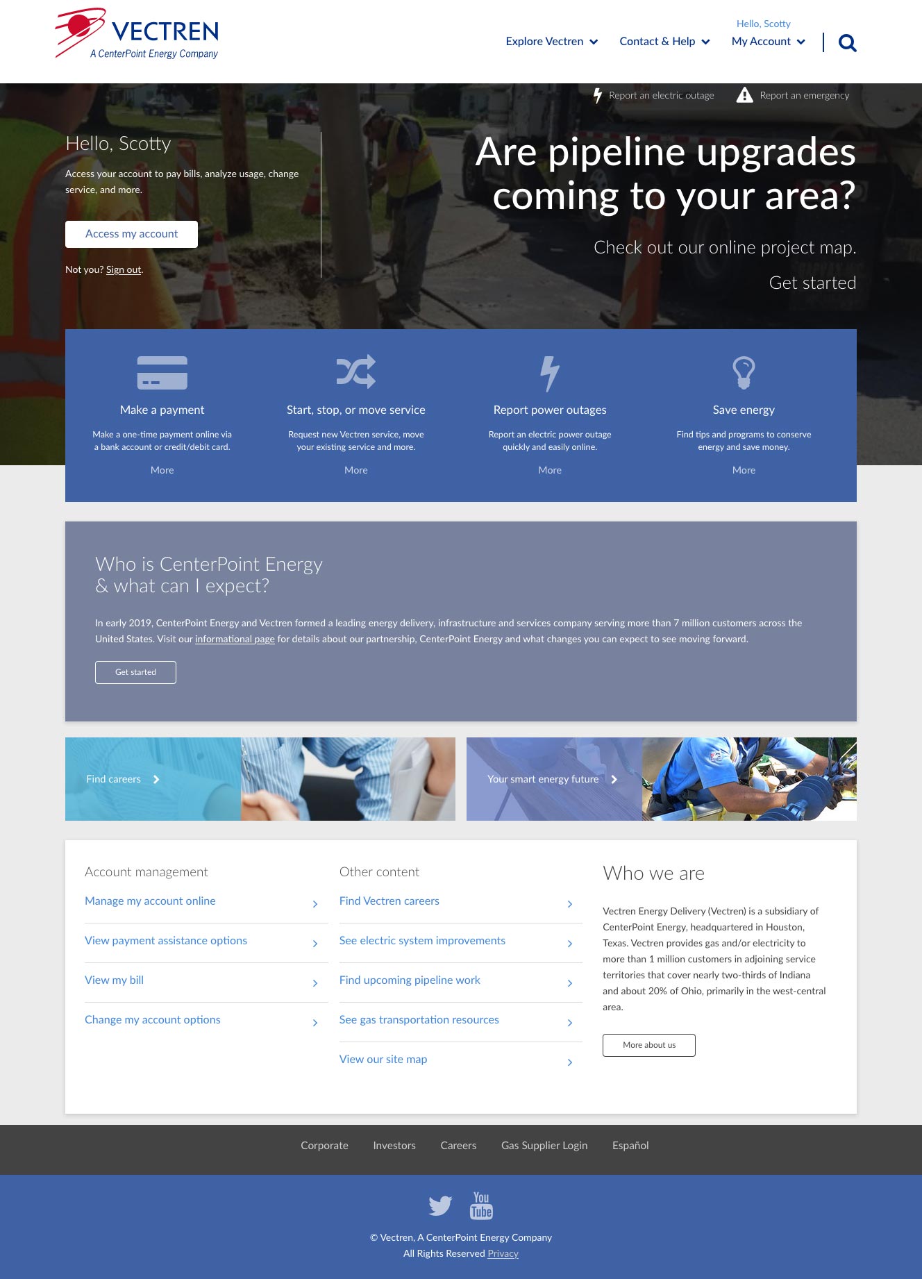
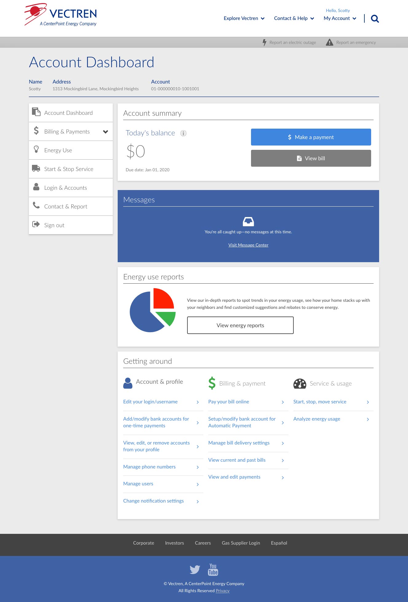
Redesign both the public marketing site and the "Manage My Account" internal customer-facing portal.
This was, technically, Vectren's first overall, strategic, ground-up redesign. Until this point, their websites—public and customer-internal—had been growing organically and sporadically. The company engaged us to not only perform the work, but to be a partner in helping them shape their digital roadmap and advance their digital footprint more strategically.
The project followed a set of recommendations for a model for customer engagement maturity:
- Deliver operational excellence
- Optimize the customer interaction
- Create a lasting customer experience
- Extend the value proposition
Key objectives
- Modern visual design that aligned with and evolved the brand
- Streamline and reorganize content across the public site
- Expand on customer self-service options
- Increase the happiness factor: make the site easier to use—and feel easier to use
- Reduce costs of real-time customer support
Services
- UX & information architecture
- Assisted with content structure and card sorting exercises
- Wireframing
- Visual design
- Front-end development
Important to note
While a compelling visual design was critical, the website had to perform. Reducing real-time support costs was a top priority for the company—and a key metric by which the success of this site and project would be evaluated.
We set out to address this in three ways:
- The most obvious: identify the most important user actions and make them as clear and easy as possible to complete
- Offer support and in-line context to help users recover in real time before they get frustrated
- Promote the use of the company's live chat service for real-time assistance, which was more efficient than phone-based support.
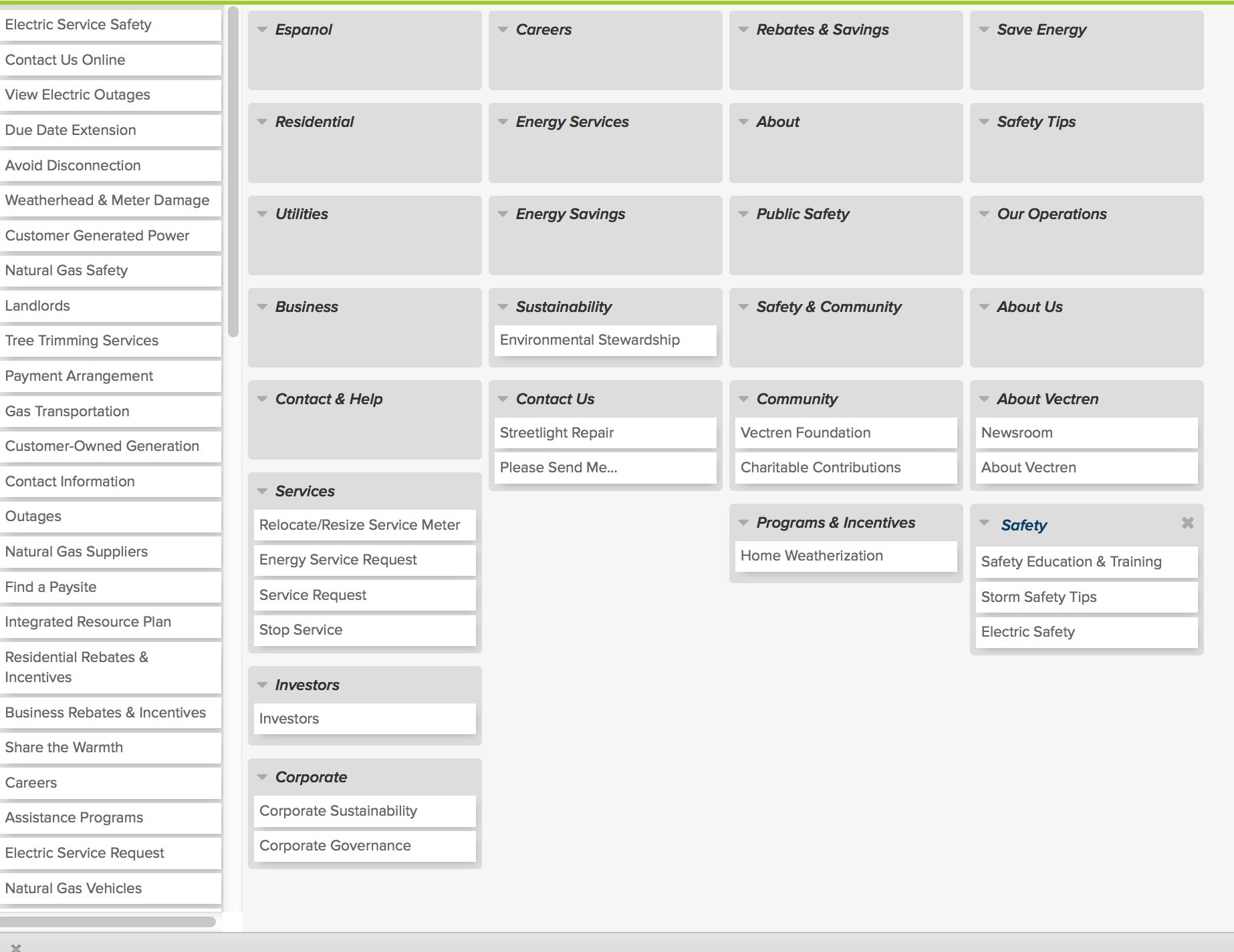
Organizing Content
Helping the client to gather, prioritize, and sort their content was essential to delivering a site that worked for users.
Maintainability was key
Turning over a site that was easy for the company to maintain, evolve, and manage was also vital to the site's long-term success. Not only did the page templates need to structure content in such a way where it was easy for users to consume information, but we needed to balance visual interest with maintainability for the company's tech team.
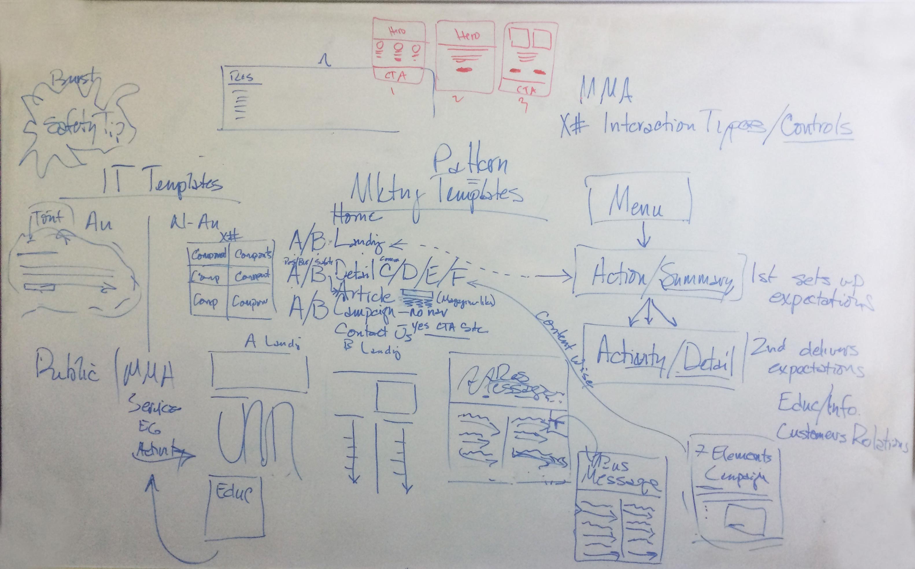
Wireframes
Based on interviews, analytics, and user testing, we designed the pay my bill process to be fast and effortless.
-
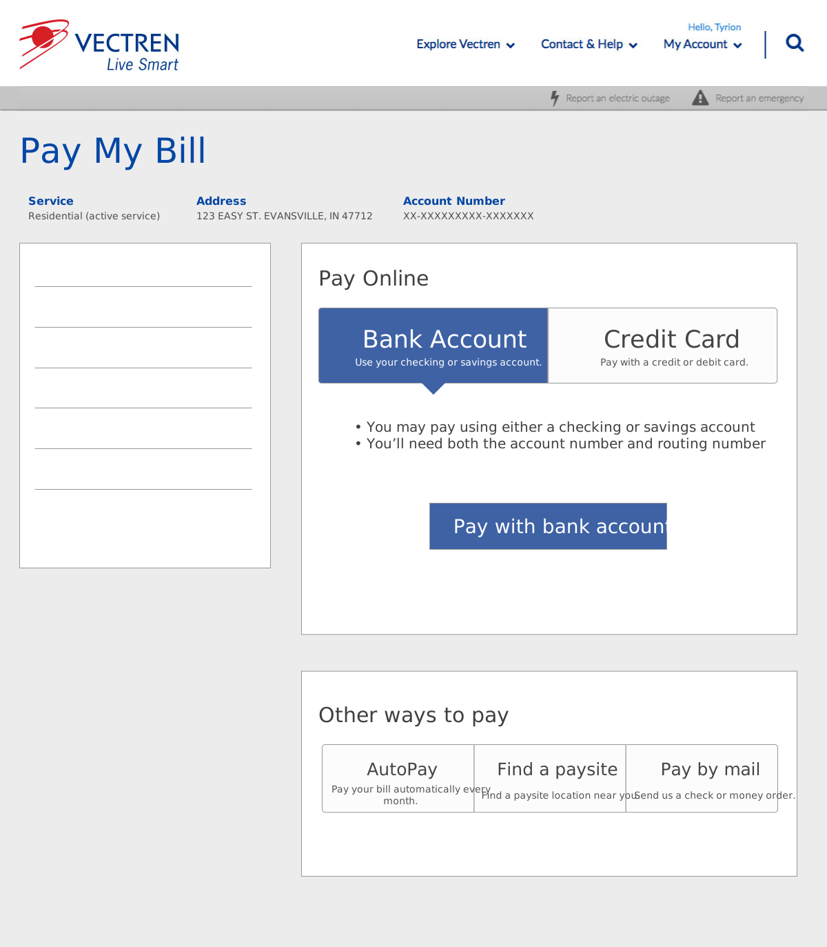
Wireframe showing the beginning of the bill-pay process -
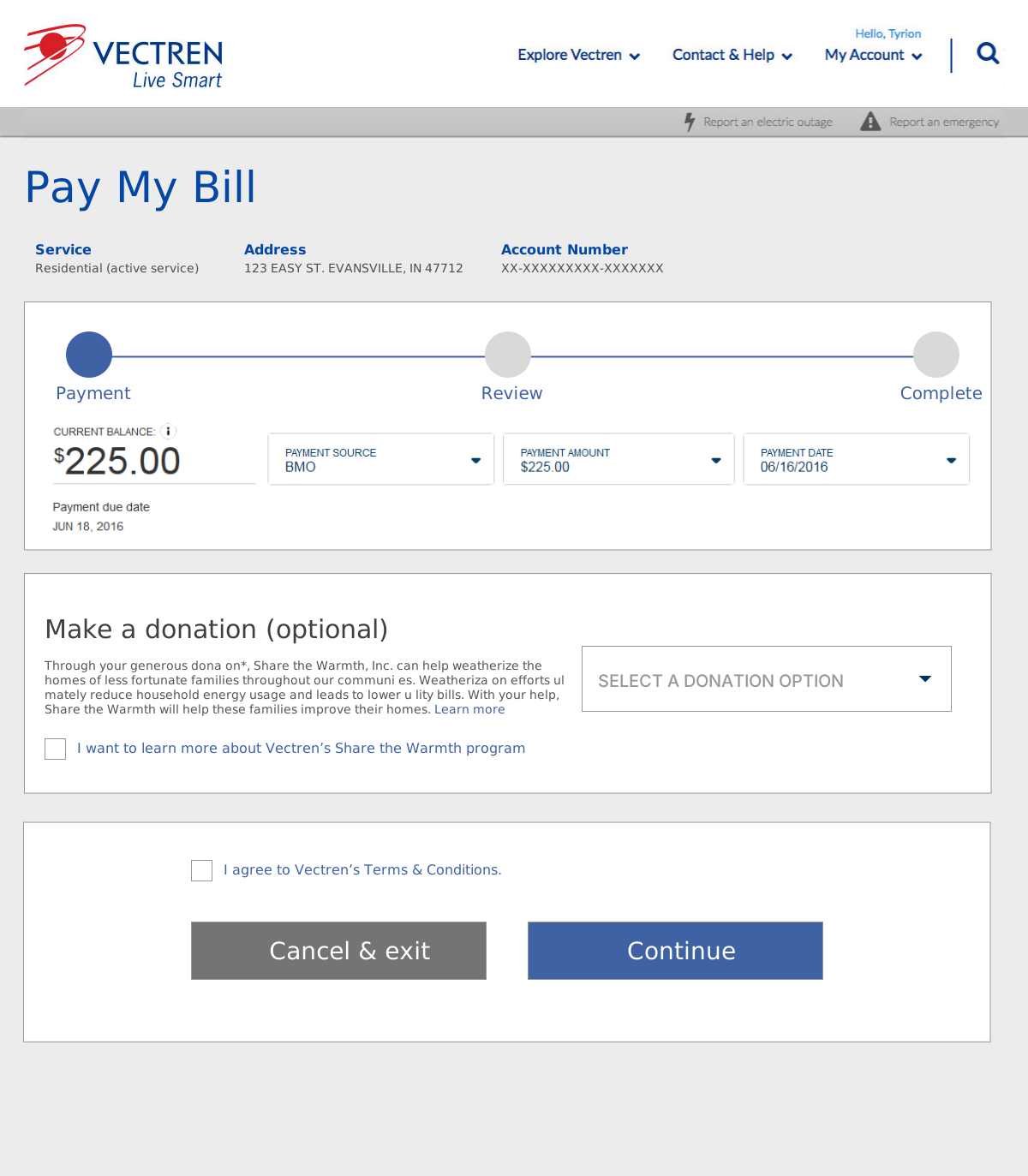
The beginning of an easy, 2-3 step process -
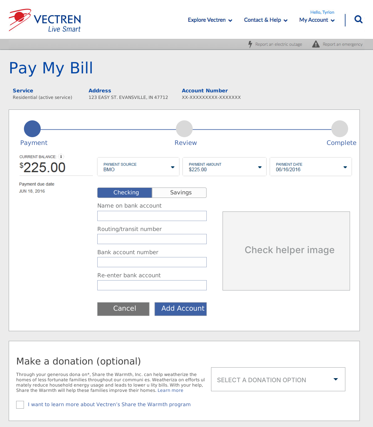
Wireframe depicting adding a new bank account inline -
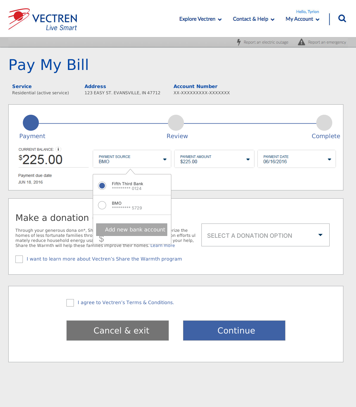
Allow the user to easily switch bank accounts. Useful for commercial clients. -
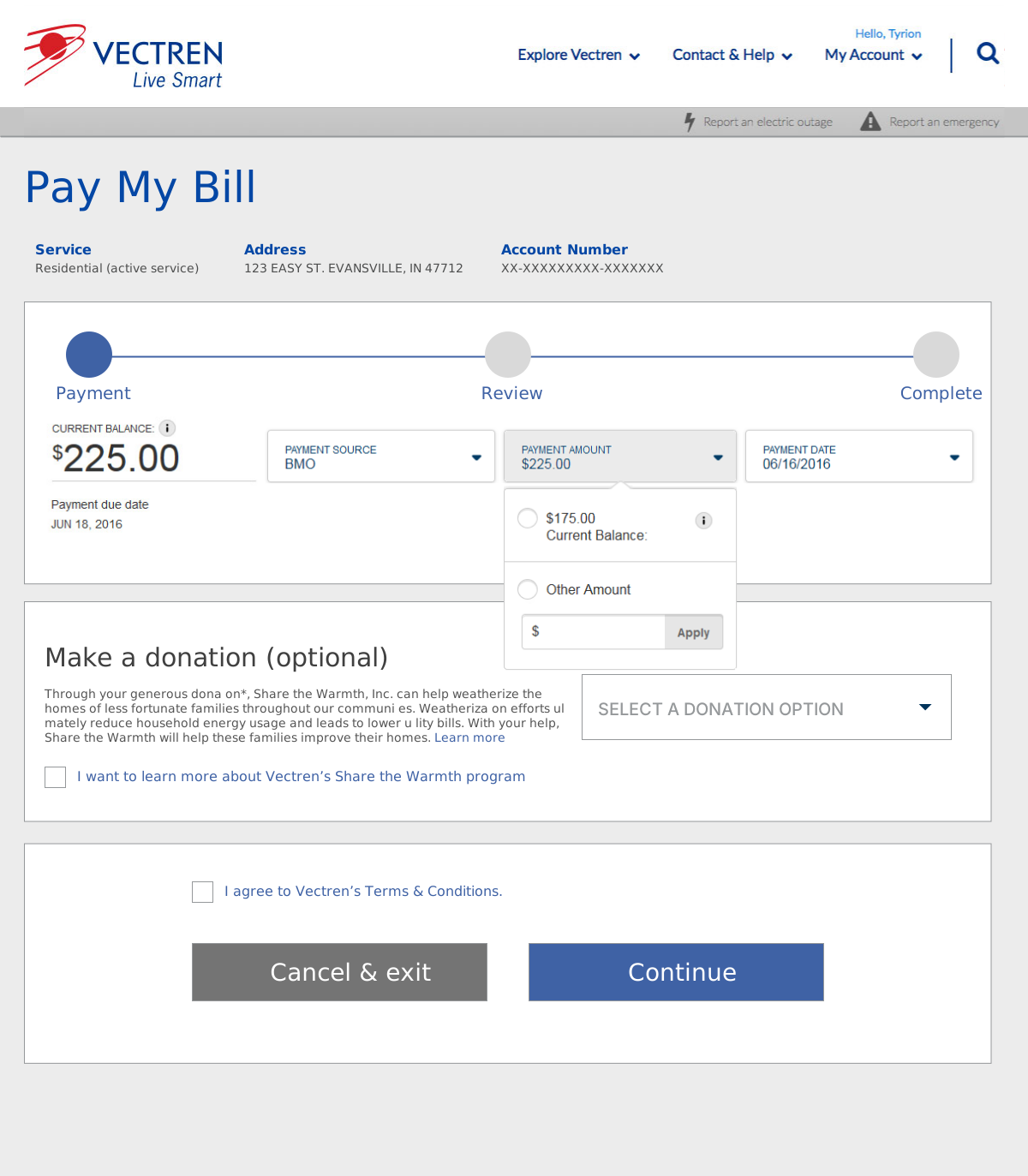
Allow the user to adjust the payment amount. -
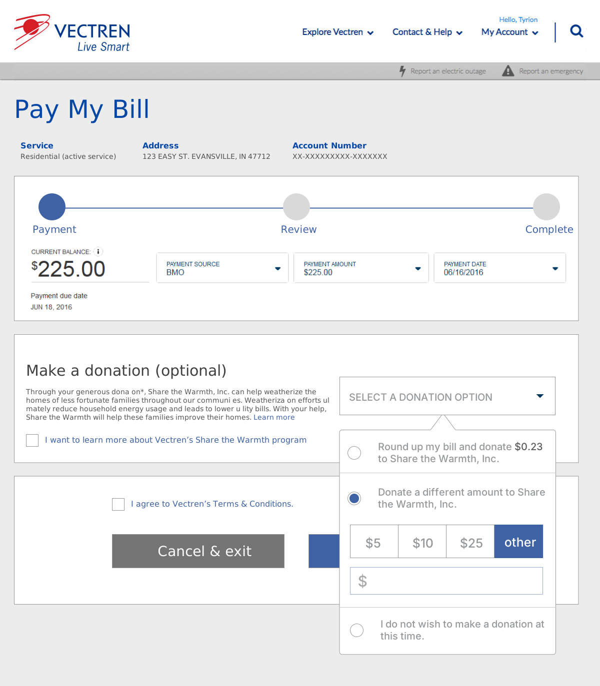
The donation-rounding was important to the company. We had to determine an easy way to build it in without distracting from the easy process. -
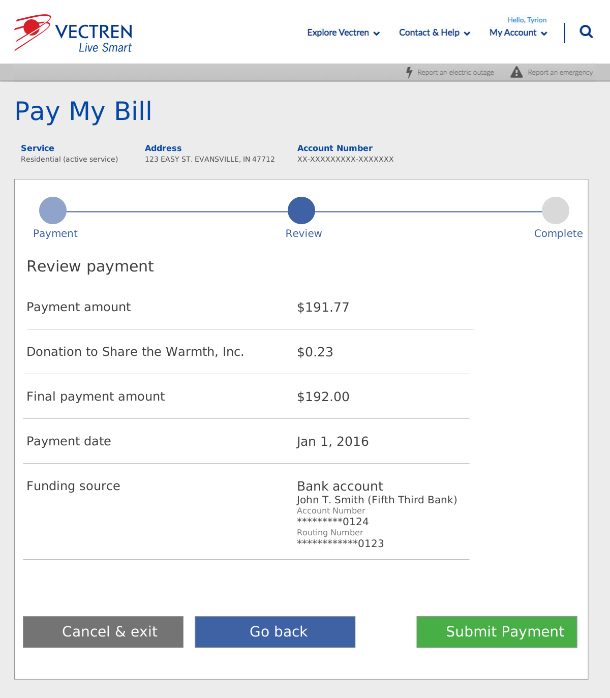
Show a quick, standard confirmation window. -
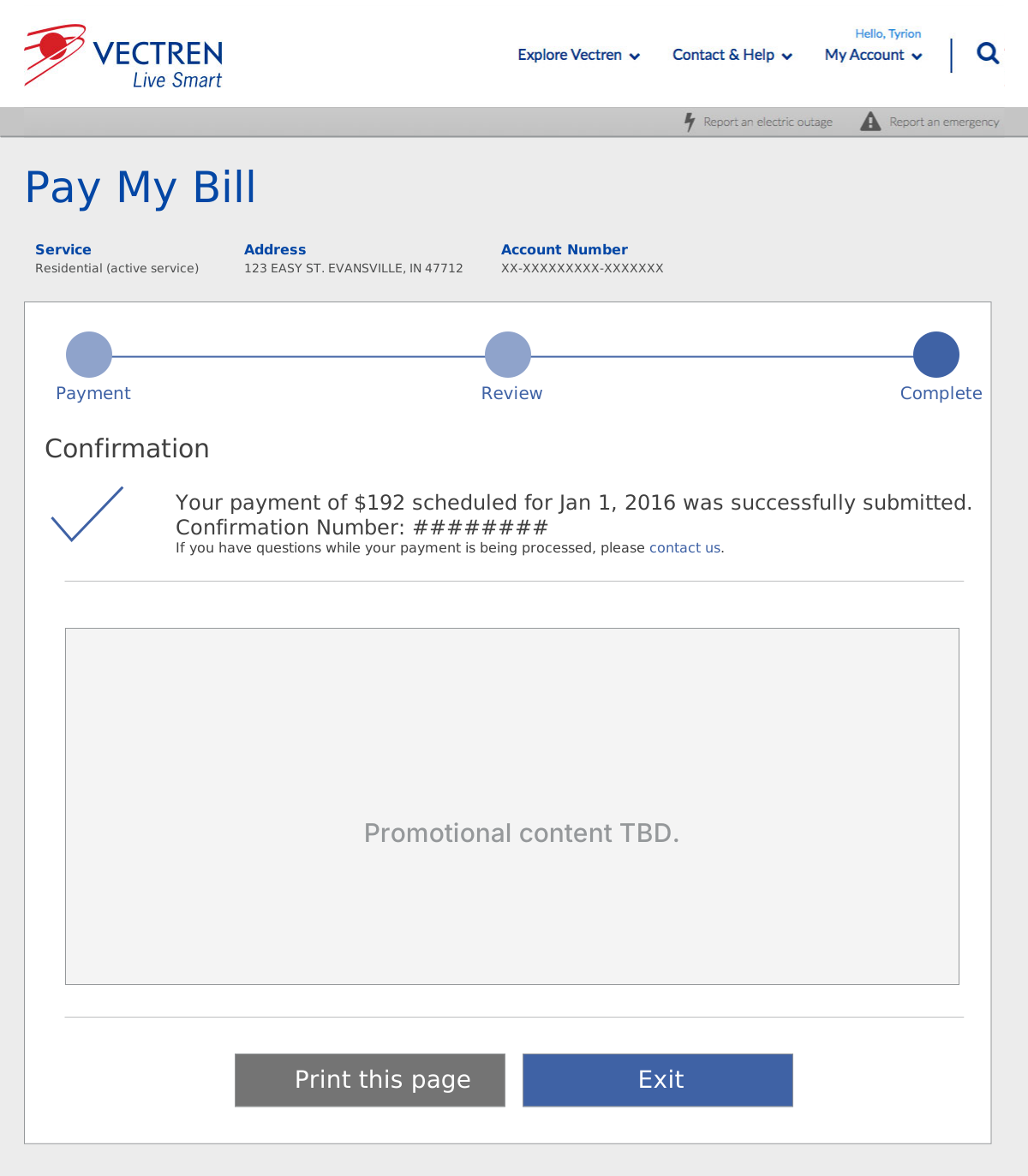
Confirm the transaction for the user. Give them some additional options, as well as built-in marketing for the company.
Visual Design
The final product—where content, design, and thoughtful UX attention to detail came together.